SILVER SUN TEAHOUSE
Brand Identity + Packaging + Print
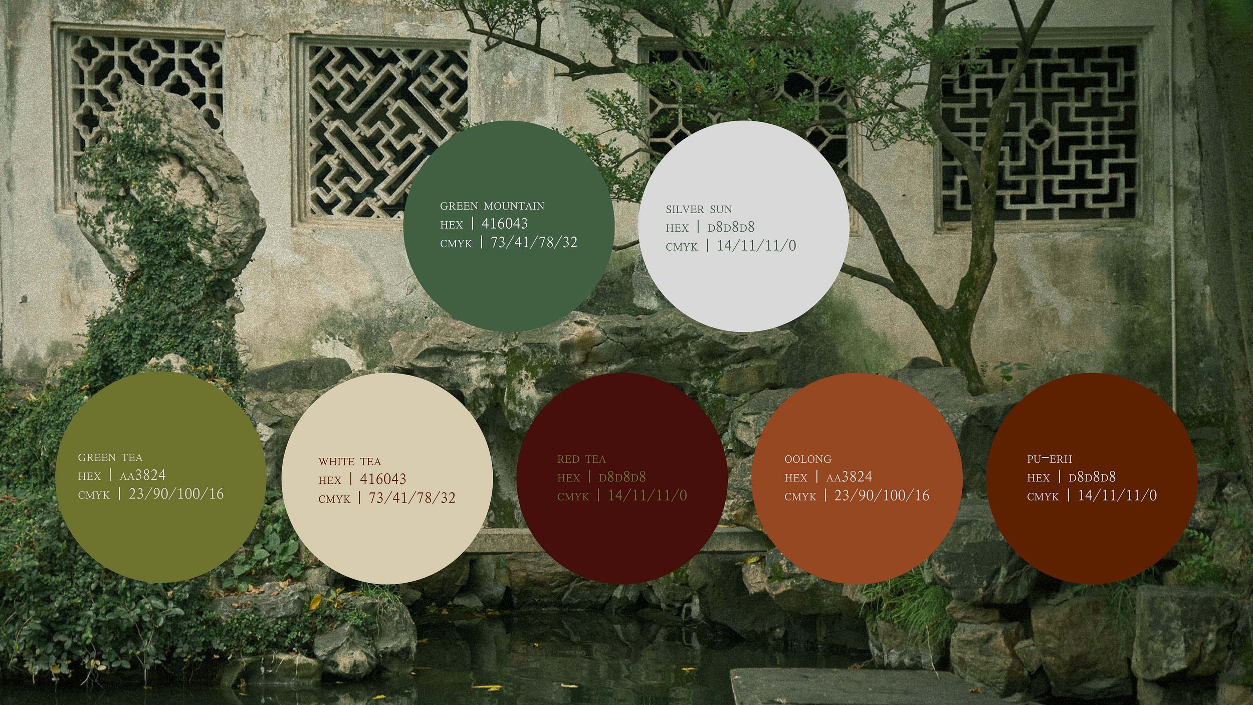
Silver Sun Teahouse seeks to position itself as a bridge between ancient and modern-day China, serving traditional Chinese teas, while continuing to practice maximizing the flavor and aesthetic experience of drinking a cup of tea, and elevating this process to an art form.
Client
The Objective
Create a unique graphic identity that highlights the traditional practice and regional complexity of teas with a modern twist. To visually communicate the main message: the brand must embody the essence of the art of tea-making from the steeped history found within the mountainous ranges of China, to the light found throughout the valley floors.
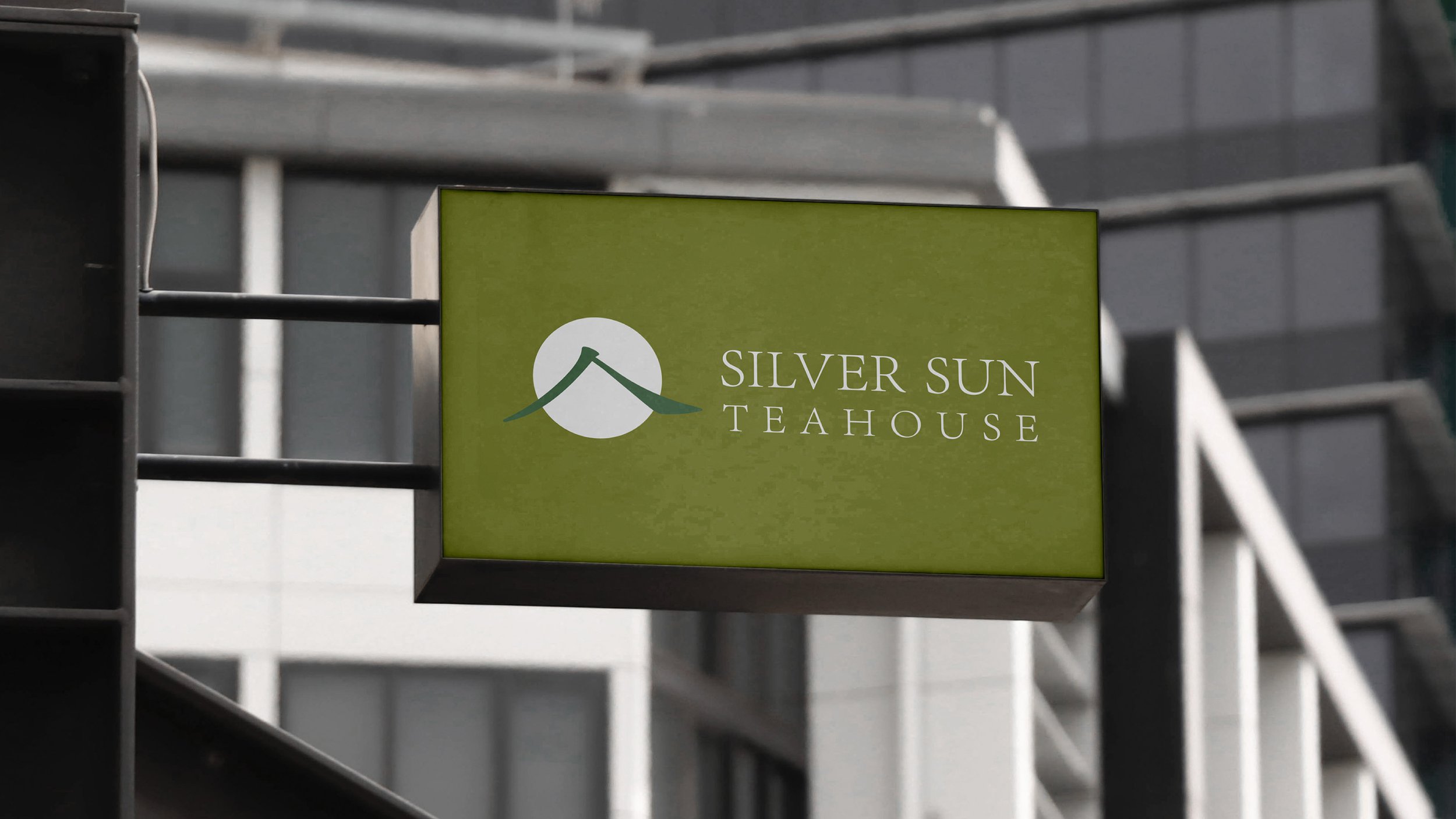
A modern serif logo was designed, and through specific strokes from the Chinese character 茶 (cha; meaning tea), it graphically reflects the name of the project as well as visually represents the roof of a teahouse. As a graphic complement, the icon of the moon’s silhouette and the inside of a teacup use a clean, organic form that shows the natural architectural essence of the brand.
The Solution


